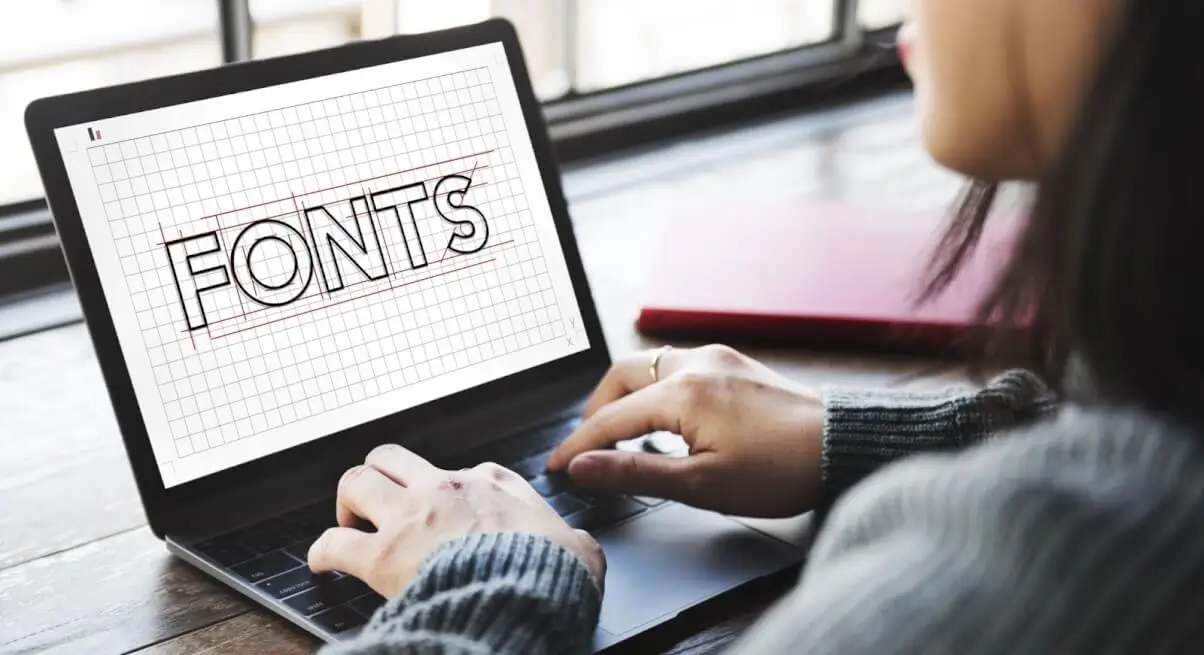
The Psychology of Fonts


- What Is the Psychology of Fonts?
- Serifs: Trustworthy Fonts
- Slab Serifs: Powerful Fonts
- Sans Serifs: Friendly Fonts
- Modern Sans Serifs: Chic Fonts
- Conclusion: The Power of Font Psychology
Fonts can communicate in more ways than just words. In fact, the best design work out there utilizes the visual qualities of fonts to help convey and connect with the audience.
What Is the Psychology of Fonts?
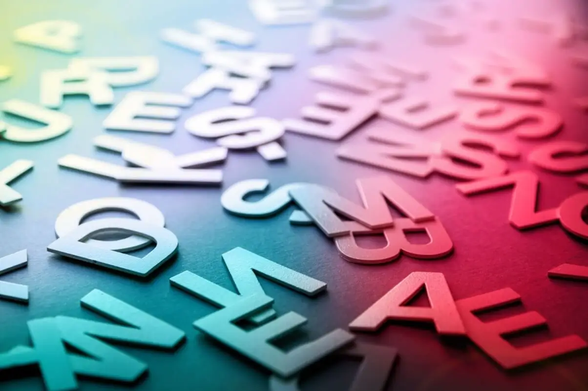
So, what do we mean when we say the psychology of fonts? While the imagery is not just plain old imagery, we interpret it. Let’s check out a really basic example. Here we have a red heart shape. What does this visually communicate to you?
If we change this around to a blue heart is the meaning any different? Your answer likely depends on things like your background, your experiences, and your perspective. That is why it is so valuable for designers to know their target audience. Then, if you can play into ideas, you can better communicate with that audience.
Or, for example, humans tend to anthropomorphize things that we see, like applying human characteristics to non-human things. In many ways, humans can be more engaged with visual content than textual content. So, looking at fonts, and how the font looks, matters a lot. Let’s check out an example.
Serifs: Trustworthy Fonts
Let’s say these two examples are both logotypes for a bank. Which one looks trustworthy to you? Likely, you’d pick one on the left, because one on the right looks too informal. This matters, because we’d want the business handling our finances to be trustworthy and responsible not playful or whimsical.
While there are a lot of factors here we could experiment with, like color and proximity, the font itself does play a substantial role in how this example communicates. So, let’s explore this idea with different types of fonts.
Serif fonts have these little brackets on their ends, those are called serifs. And serif fonts tend to be associated with keywords like stability, tradition, intellect, and formality. For a long time, the quote “Default font” in a lot of software was Times New Roman - a serif font. Historically serifs had a large presence in print as well. Organizations like universities, financial institutions, and law firms, all often take advantage of the look and feel of serif fonts. These organizations want to convey that kind of idea that they have a history and that they have stability.
Luxury brands often draw on serif fonts too, because they can look classy and high-end as well.
Slab Serifs: Powerful Fonts
Slab serif fonts also have serifs, but notice that these serifs are chunky and block-like. It significantly impacts the aesthetic. Slab serifs tend to be associated with keywords like enduring, strong, and powerful. Perhaps this is in part due to the heaviness that this type of font often has. You can of course have lighter slab serifs but the traditional aesthetic that comes to mind is this sort of chunky look. Unlike traditional serifs, slabs don’t have that same somewhat delicate look. Organizations like car companies often work with slab serifs because again, they kind of have that Brash and Powerful vibe. It can also work well with outdoorsy projects or something that has to do with camping.
Sans Serifs: Friendly Fonts
Sans Serif Fonts do not have serifs at all, and there are many different classifications of sans-serif fonts too. We’ll just take a general look at this type of font. They tend to be associated with keywords like Progressive, Informal, Open, and even Friendly. Therefore this can be considered as an emotion font style to some degree. Sans serif fonts also have a degree of neutrality to them which can make them a versatile choice when you are working on a design.
If we look at brandings like FaceBook, Apple, or Spotify, we will see Sans-serif fonts. They are clean choices and they often have an association with things like Tech or other industries that thrive on new features and innovation.
Modern Sans Serifs: Chic Fonts

As we mentioned, there are many different classifications of sans-serif fonts. Let’s take a look at some of the more modernist styles fonts with some geometric inspiration, whether it be directly or strictly geometric or a little more loosely associated.
You might see fonts like this associated with things like luxury and elegance, for example, fragrances, fashion, and high-end products might lean towards this type of fonts that evoke emotion. Interestingly, if we take these types of fonts and round them off, it changes how they communicate. Notice how a rounded sans-serif suddenly becomes a lot more informal, maybe even more appropriate for a younger audience.
Conclusion: The Power of Font Psychology
Font psychology reveals typography's profound influence on perception. Serif fonts convey trust, ideal for formal institutions, while slab serifs evoke strength, fitting for rugged industries. Sans serif fonts offer modernity and friendliness, favored by tech companies. Modern sans serifs are to convey emotion fonts that exude elegance, used with rounded variations appealing to younger audiences. Understanding these nuances empowers designers to create compelling, emotionally resonant experiences.
Author


Founder of VJump. In addition to business, he is passionate about travel photography and videography. His photos can be viewed on Instagram (over 1 million followers), and his films can be found on his YouTube channel.
Moreover, his profile is featured on the most popular and authoritative resource in the film industry — IMDb. He has received 51 international awards and 18 nominations at film festivals worldwide.